


For about two years now, a norm has emerged on the Mingle team: “Every story is 4 points.” As a BA on our team, I quipped, “Well, that’s because our BAs are particularly good at writing stories.” :)... And then started digging into data to understand why.
Let’ s analyze our data
I created two charts below using data from one of Mingle’s previous releases and found them to be strikingly similar.
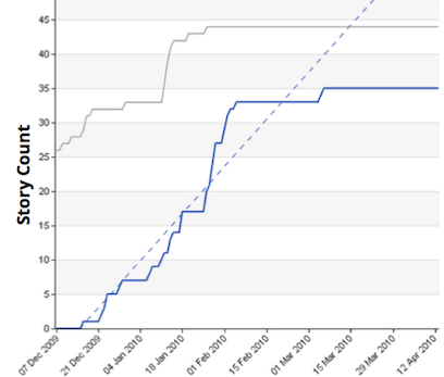
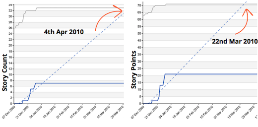
This chart maps the story count over 3 months for a release:

This chart maps story points over 3 months for a release:

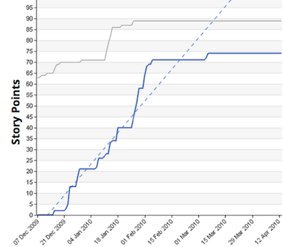
Aside from the Y-axis scale, can you tell any obvious difference? I bet not.
Why is that the case?
-
Stories got broken down within the same range during team conversations
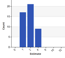
When we estimate on the Mingle team we always have representatives of every role, if not the entire team. During estimation, everyone is involved in breaking big stories into more digestible pieces. We use a 1-2-4-8 scale, with 8 as our threshold. Anything estimated bigger than 8 becomes a placeholder for further breaking down. Below is the distribution of our estimates used in the burn up charts on the previous page.
Similar story sizes was the result of the conversations on our estimation sessions. This contributed to the similarity of the earlier burn up charts.

- Size differences got evened out over time
Applying normal distribution to story points, standard deviation decreases as the sample size grows.
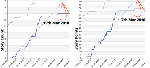
Forecast of story count vs. story point, 2 weeks out

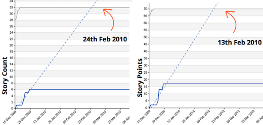
Forecast of story count vs. story point, 1 month out

Forecast of story count vs. story point, 3 months out

Which is why we refactored our process
Looking at our data, we didn’t find any additional value that story points provided us (related to progress tracking). As such, we have transitioned from story points to story count:
- We still maintain our estimation sessions. We highly value the team conversation catalyzed by gauging the size of the work.
- Leave the estimate points as a reference on the card, which could help inform prioritization. But we do not translate those numbers into scope or capability.
- We started using story count in our burn-up charts.
We use a 1-2-4-8 scale, with 8 as our threshold. Anything estimated bigger than 8 becomes a placeholder for further breaking down.
Below is the distribution of our estimates used in the burn up charts on the previous page.

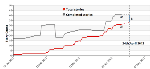
We believe that the key to progress reporting is not an “accurate” prediction, but visible signals that we can act on. We look to our burn-up chart to tell us: “Hey, it looks like we might not be able to get everything done by the expected date. Let’s have a conversation.
We are happy with this change
It has resulted in these two significant benefits:
- Fewer metrics, more conversations: In estimation meetings, we have shifted focus from numbers to a collaborative conversation. This provides a better platform for our team to discuss and eventually establish a shared understanding about what to build and how. We noticed that subsequent development work became much smoother after these conversations.
- Less math, more effective planning: In scope planning meetings where we used points, we had to scratch our heads to figure the exact number of points to put in or take out. Freed up from these calculations, we focus more on business value and being more responsive to ad-hoc requirements.
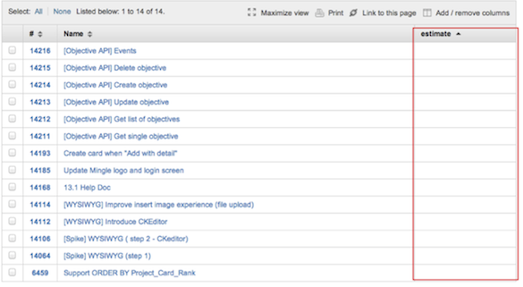
Yes, the estimation column is empty! As the estimation points had naturally phased out of our process, we had an explicit conversation during our retrospective about whether or not we should reinstitute them. We decided not to, and have been happy with it.

In summary, I would like to quote Martin to support our decision: “So whenever you're thinking of asking for an estimate, you should always clarify what decision that estimate is informing. If you can't find one, or the decision isn't very significant, then that's a signal that an estimate is wasteful."
Disclaimer: The statements and opinions expressed in this article are those of the author(s) and do not necessarily reflect the positions of Thoughtworks.