


In the race to making data consumable, we’re experiencing an explosion of highly effective, engaging and creative visualizations that connect with consumers in unique and interesting ways. Some of my favorites are We Feel Fine which visualizes general feelings populating the blogosphere on any given day, LinkedIn’s own visualization tool for visualizing your networks (InMaps) and visualizing the number of US gun killings and their impact represented as the “stolen years.”
So how do you decide on the most effective visualization? And how do you know if you’re on the right track to making an impact?
Here are five principles for creating effective data visualizations told through a recent visualization project I worked on which involved taking years of hospital spend data to find areas for cost optimization at hospitals. By applying lean UX techniques to rapidly create interactive visualizations, we helped the client save months of traditional upfront design effort and costs.
#1 Be open to discovering new insights
Effective data visualizations enable the user to discover unexpected patterns and invite a different perspective of the data. During the first few iterations of looking at the data, we used visualization tools (Tableau and ggplot2 package for R) to quickly identify patterns and decide on a direction.
During this discovery process, it was tempting to focus on the goals of the iteration and avoid being distracted by unexpected insights. For example, in the early iterations of looking at the data, we found an issue in the data collection process for one customer that opened up opportunities to improve the type of data being collected. This resulted in further operational savings that wouldn’t have been discovered if the team were only focused on the task at hand.
Having a clear and disciplined prioritization process enabled the team to feel comfortable exploring new opportunities and insights that weren’t directly related to the scope of the work. As new insights were uncovered, we huddled as a project team to understand the impact, and prioritized any additional scope based on quantifiable business value.
#2 Think big but start small
Visualizing years of hospital spend data was no easy feat! Opinions were rampant and time was of the essence. Our internal users needed quick solutions to a very painful process that was costing them time and lost business. We kick started the project with a collaborative workshop to understand the quality of the data, the business objectives and the user needs of the visualization. Together we sketched out the high level end-to-end user journey, and identified a thin slice of the project by answering the question: What’s the smallest visualization we might build that gets the data into the hands of users and will generate the most learnings for the project?
We kept this high level journey alive over the course of the project to remind ourselves what we were creating and to avoid going deep in areas that weren’t necessary for the specific iteration goals.

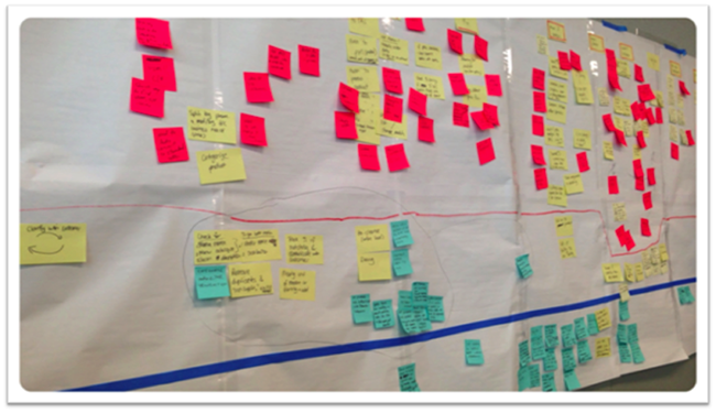
Example: User Journey Wall. The horizontal lines separate features into priority buckets across the user journey.
#3 Design for your user
User journeys and prototyping helped us define the user goals, what vital pieces of information was needed and at the right point in the process. During the first iteration of the visualizations, we realized how little screen real-estate we had! Information was tightly packed, the screen had too much information and the fonts were too small. We created a monster. It was back to the drawing board.
We explored treemaps and pie charts as ways to visualize the potential cost savings by product category. Lots of discrete clusters made pie charts ineffective. When we tested the treemaps, users found it difficult to arrive at a clear decision when comparing across product categories. Users also grappled to understand more complex visualizations as they were mostly accustomed to excel type visualizations.

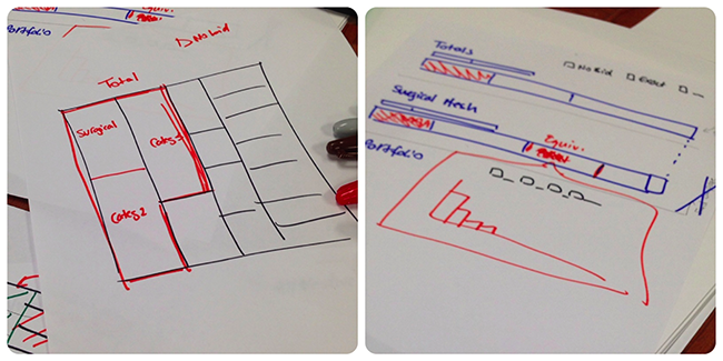
Example: exploring tree maps and interactive bar charts.
#4 Prototype to identify needs
Each visualization was created and designed by a small cross-functional team that set to find a solution at the intersection of: Will customers use it? Can we build it? And does it meet business needs?

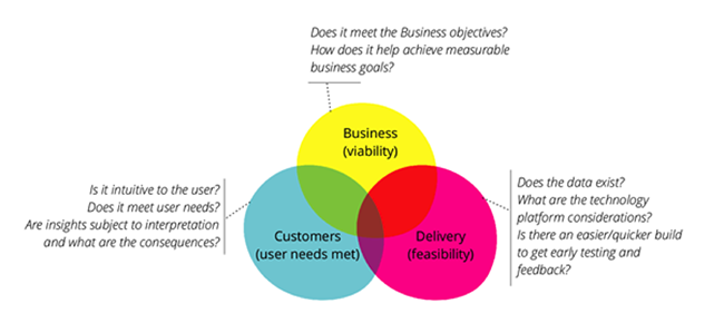
Prototyping and evaluating ideas based on three lenses of Business, Customer & Delivery.
We used a technique called ‘sketch to code’ to get the opinions and ideas of users and business stakeholders into a visual story that became the starting point for designs. ‘Sketch to code’ is a form of lo-fidelity design technique and the intent is to extract ideas quickly. This technique facilitated the requirements analysis because visuals helped create a shared understanding of what we were building beyond words. We then took those sketches and iterated on the design in code. This enabled the team to see a working version on the day the sketches were created. We had short, quick feedback huddles with the Product Manager and Users to refine the visualization. Sometimes we threw it away and chose a different visualization. This process enabled the team to learn early and pivot to a different direction when we discovered new insights from the data.

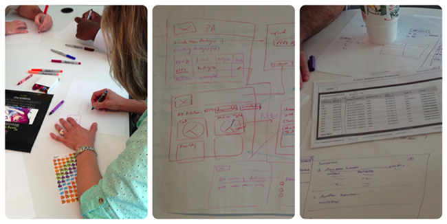
Example: collaborative prototyping to identify business and user needs.
#5 Obtain feedback early and often
One of the common misconceptions about user testing is that the user will have all the magical answers to exactly what they should see and how the system will work. In the words attributed to Henry Ford:
“If I had asked my customers what they wanted they would have told me faster horses.”
So why do we get feedback from users at all? User testing is about going beyond what your users are telling you to uncover their needs and unmet needs. It’s up to the project team to come up with solutions based on these needs identified during user testing.
For example, our first user sketching session resulted in excel tables with lots of filters and sorting! At the risk of rebuilding excel, we revisited the user goals, and did a collaborative sketching session to first define the types of data points required. Then we did a power-ideation session to come up with alternative visual ways to arrive at the user goals that were more effective than tables of data.
We learned from user testing the level of technical savviness influenced the visualizations we adopted. Visualizations had to be intuitive - users required the ability to show visualizations to aid a sales conversation. Discoverability of insights was less of a concern for the visualization. The ability to scan the results across product categories to make fast business decisions was more important for the first release.
After a few iterations and user testing, we landed on stacked bullet charts as the most effective way to visualize product spend across categories. Vertical alignment enabled users to quickly understand which product would generate the most cost savings. Leveraging the vertical scroll enabled users to quickly compare results across many product categories without the need to constantly flip across screens.

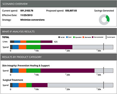
Example: visualizing hospital spend (Data and brand has been adjusted to maintain client confidentiality)
Successful visualizations consider user needs, business needs and the technology platform. It’s easy to create visualizations that are interesting but not effective for the users consuming the insights. I hope these five principles get you on the right track to creating effective visualizations.
Disclaimer: The statements and opinions expressed in this article are those of the author(s) and do not necessarily reflect the positions of Thoughtworks.