


Disruptive thinking, done visually. It’s about making your thought process visible to others to affect change. It’s about corporate graffiti as an influencing technique.

As you go about your work you’ll come up against walls. Some walls will be blank and boring blockers to progress. These need decoration; spraying with layers that have meaning. So pick a corner and start doodling. With a new perspective, you’ll find a way around the blockers. Other walls will come with messages - by design or default - leading you in a certain direction. If this isn’t where you want to go, you’ll need to plot your own course by subverting or overwhelming the prevailing visuals.
This is your challenge, and your opportunity for innovation: to disrupt the established visual environment with new ways of looking at the world that, in turn, unlock new ways of thinking. If you think you could make your organization more agile with some disruptive visual thinking, read on for my experience.
A Call Centre
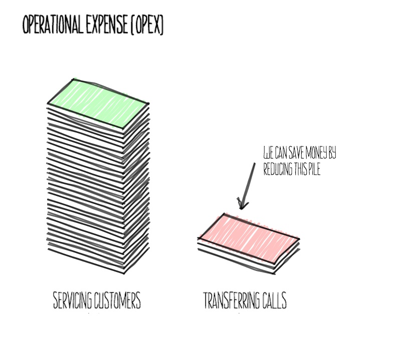
The context for this piece is a huge call centre at a large telco. We’re talking hundreds of thousands of calls, tens of thousands of agents, multiple geographies and time zones, and hundreds and hundreds of complex products. However, it’s made even harder to manage by the byzantine rules that determine which agents can pick up a given call. This leads to dissatisfied customers and wasteful operations. There’s an ever-evolving portfolio of organizational initiatives to serve customers better. One element is a program of work to route calls better, and to measure the improvement against customer satisfaction (measured by Net Promoter Score, NPS) and operational cost (OpEx).
Original Visuals
We pick up the story when the best picture of the call centre we can get is a CSV file.
If we could see the raw picture hiding in the CSV data, we could watch every caller’s journey, from the point they arrive at the call centre, to when they finally hang up. But we can’t see any kind of picture, and this is problematic for many reasons. The first reason is that no-one but a select few experts can make an observation based on the data or form a reasoned argument from the data.
I felt that if everyone could literally see a picture, then everyone could contribute. I asked the experts to help me out. They gave me their dashboard.
This was a start, but it wasn’t a truly shared view, because being restrictively licensed software, only the experts had live access. We could work around this, but it would remain an undesirable bottleneck. The next step was to democratize access.
Democratic Visuals
I’d been keen for some time to try the open source visualization tool Processing and this seemed like the perfect opportunity. The experts were on leave in the southern summer, and the team I was coaching was effectively blocked as a result. Though dashboard access was limited, the CSV data was readily available.
Democratizing visuals meant thinking of what might be interesting to display, and hacking around that until I’d produced a picture from the data. Transferred calls are a major source of both frustrated customers and operational spending, so I started with a “chord diagram” showing calls being transferred (across the interior of a circle) between different classifications (points on the circumference of the circle). It didn’t change the world for anyone, but it validated the approach for me. Anyone could run the Processing “sketch” on the data.
At this point, I deliberately chose a black background in opposition to the existing dashboard. A small disruption to say: “look at me, I’m different”. I wanted to be different to the existing dashboard because it had a major failing; nowhere did it show the outcomes the program was seeking to achieve: a balanced improvement in NPS and OpEx.
Outcome-Oriented Visuals
So the dashboard didn’t show the key measures of success: NPS and OpEx. Fortunately, the client in this case had simple models that could be used to estimate the metrics based on call outcomes under a proposed set of rules (note to purists: they couldn’t test this stuff live, much as they wanted to). I just had to find a way to visualize these numbers.

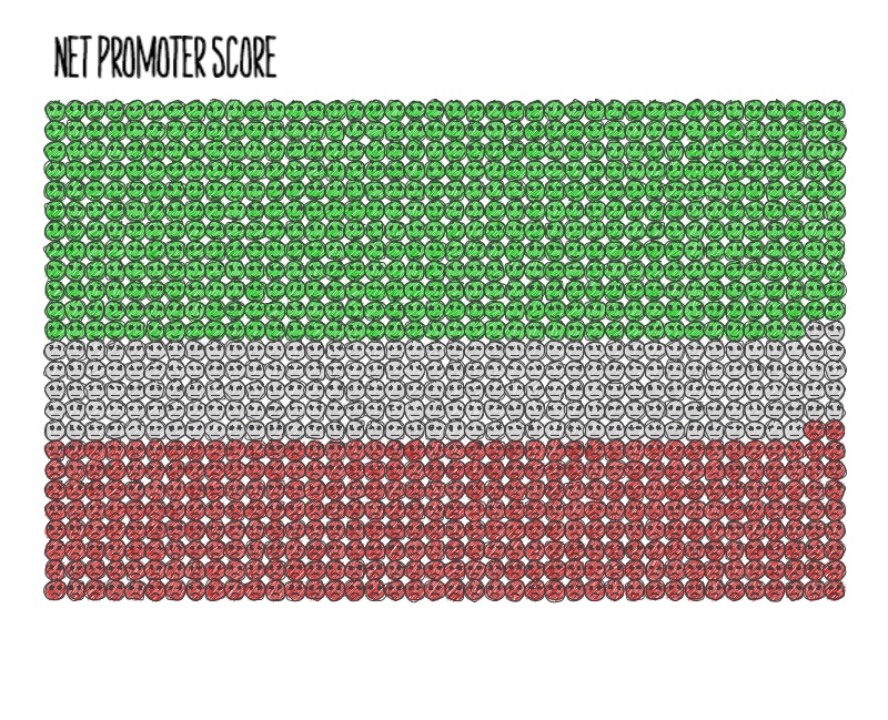
The visuals provided great leverage in discussions with the experts, the broader team and stakeholders about what the program could possibly achieve and what it was actually achieving. We could break the framing imposed by the dashboard. The discussions would have been pure speculation without these pictures (they remained somewhat speculative, but at least everyone was now speculating over the same picture). To make people sit up and take notice, I also wanted to amplify the disruptive look, and was delighted to find the hipster-friendly handy library for a hand-drawn look and feel. The intended disruption this time was: “see the wood for the trees”.
Post-production, I was able to rationalize this approach further. Let’s distinguish these unorthodox visuals from their orthodox counterparts - produced in Excel, PowerPoint, etc. I would argue that unorthodox visuals engage our “slow” or logical mode of thinking. They are therefore more likely to persuade through rational argument than orthodox visuals. Orthodox visuals only engage the “fast” or stereotypical mode. In this mode, the existence of a visual is recognised, and then the mind moves on. No effort is made to understand the content of the visual, hence there is no possibility of rational persuasion.

The creators of the “handy” library also conducted research into how people respond to sketchy graphics. Their research concluded that engagement may be increased by sketchy graphics, and people feel better about annotating sketchy graphics. Thus we may co-create corporate graffiti!
These visuals had a disruptive effect, but they only showed us what we expect to see. I soon realized we needed a way to visually discover unknown phenomena.
Visual Discovery
To surface unknown unknowns, I wanted to create as raw a view of the data as possible, including the time dimension, so I set out to animate an entire day’s traffic.
I went back to the chord diagram and produced something of a cross between an amoeba and the Death Star stuck in a disco, as it rattled through 24 hours of call data in a few minutes. I kept iterating over it though, until someone kindly said, “It’s like the Matrix”. This was patently untrue, but such a good idea that I decided to make it so.
“The Matrix” was definitely disruptive. It was the perfect metaphor, as we were searching for glitches. It looked so intricate that it was difficult to refute on face value. It was surprisingly beautiful and mesmerizing. But best of all: it worked. It did what it was supposed to, it surfaced unknown unknowns.
The team found a bunch of issues we would never have thought to look for otherwise, just by sitting and looking at The Matrix. We found calls going for 3 days past the 24th hour, we found transferred calls going back in time, we found incoming calls jumping the FIFO queue, and many other issues. The discovery of issues would be heralded by “That’s interesting... is it supposed to do that?” After some discussion, we would conclude that it wasn’t. We could then investigate further.
The Matrix empowered the whole team to contribute. Interaction with The Matrix pushed people into open-minded playfulness, making them receptive to new ideas. The “fuzziness” and intriguing difference of this visualization primed people to ask leading questions. In this way, we discovered promising avenues of investigation that would otherwise have remained hidden.
These leading questions and new ideas became the starting points for rigorous analytical investigation that resulted in measurable improvements in data quality (and hence program outcomes). The investigation into the root cause followed a general pattern: we could agree what the issue should look like when fixed, and then make it look like that. You could call that process Visualization Driven Development.
Visualization Driven Development
As we became more comfortable with understanding what we were doing visually, we would preface a new piece of work with a discussion around what the end result should look like, literally. We would start with a picture. If we were dealing with a defect, we would identify what was wrong with it. For both defects and new features, we would agree what the picture should look like when development was done. We could then develop a visual fixture to test any build and establish compliance. With the visual fixture, we could literally see the gap to be closed. When the gap had been closed, development was done. The picture shows one of the visual fixtures - we were trying to clear all of these exceptions from the plot.
Do Try This at Home
I hope you’ve enjoyed this article, but I’d prefer that you’ve found some way to turn it into action. You can do this yourself! You don’t need masses of data either. You just need to show someone a picture that demonstrates the scope for action in a form they’re not expecting.
Don’t think that because I’ve articulated myself reasonably clearly here in retrospect that I had a fully-formed strategy from the outset. I just did a little something that felt like the right thing, assessed the impact, and repeated. You can do the same.
The key ingredients are curiosity, and a willingness to experiment. This will iteratively lead you to a solution for your context. While I used a visualization tool, that’s not essential, especially when we’re talking about outcomes and framing. Sharpies and butcher’s paper are great tools too!
It needn’t be a solo effort, either. You can get the whole team behind a disruptive visual thinking exercise, bringing together strengths in artistry, analysis and programming (where required). Even so, you don’t need a work of art, statistical excellence, or perfect code, you just need to spray some corporate graffiti on a run-down mental wall to get some disruptive visual thinking.
Disclaimer: The statements and opinions expressed in this article are those of the author(s) and do not necessarily reflect the positions of Thoughtworks.