


People arguably spend as much time analyzing test failures as they do writing tests. This necessitates good functional test reports. A good functional test should not merely report where your test failed. It should give you all the information necessary to be able to make your analysis.
- Do you have a separate team that figures out why your tests failed?
- Have you often, after having analyzed a test up and down have no clue why it failed?
- Do you have to constantly cross-refer the environment where the test ran?
If you answered yes to the above, then your reports are just not working well for you.
What makes a good report then?

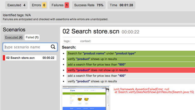
A Report with great visibility - showing ALL steps that have been, are being and will be executed.
Be a show-it-all
First and foremost, a report should tell you everything that led to the test failure. A mere stack trace is not enough. It should tell you all the steps that came before that led to the test failure. Very often, it is not the line where a test failed that is important but the steps before it. Perhaps you forgot to clear the cache at the right time. Perhaps the driver you are using did not click a button in a form. These might not reflect in the final failure. The final failure might be a verification that checks to see if a form was filled.
This information is best understood when the entire test is in front of you with a clear indication of where the failure occurred. An accompanying screenshot and a stack trace are minimum requirements of course.
Differentiate Expected and Unexpected Failures
Your report should differentiate those tests that have failed on an assertion or verification from those tests that have failed unexpectedly. Typically your tests can fail for one of three broad reasons
- Your application broke something and your test caught it
- Your test broke something within itself
- Your environment broke something
Figuring out which of these three caused your test to fail is half the challenge in analyzing tests. If your tests can visually indicate this, then the effort to discover your actual problem is considerably reduced. You can begin to focus on errors (unexpected behavior/exceptions etc.) instead of failures (assertion failures) or vice versa depending upon your needs.
Provide data that can be analyzed programmatically

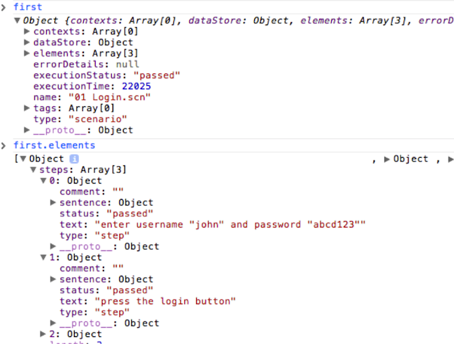
Example of programmable JSON test data
Often, you require data from your tests to programmatically analyze it or produce other artifacts from it. For instance you might want page request times to be logged and graphed so that you may monitor a specific page's performance over a period of time. Not only should your report provide some way where this can be logged, but it should also be able to provide a way to access this data programmatically.
This access is important because then, you need not spend time writing and maintaining scripts that do nothing other than scrape data from one format to another. More importantly, having access to this data lets you build dashboards and trends that might be useful to monitor other aspects of your functional tests. Apart from the page request times mentioned earlier, you might be able to link your test to a specific story in your project management tool.
Separate data from presentation
Tools often embed the data they present with the presentation itself. This is a common anti-pattern and requires correction. Coupling the data and presentation together makes reports rigid and will not let you customize it and add things you find valuable to the report. A good example of this is having a video of your test recorded. For any test that fails, this might be an invaluable way to figure out what caused the failure. Perhaps your testing tool does not have this feature, but you have developed it and wish to view it as a part of your report. In order to let you do this, the tool has to separate data from its presentation. This implies that people can then choose to consume the report data in any visual form they find relevant and are no longer tied to the defaults that tools provide.
Common Analysis and Reporting Mistakes
Fail percentage means nothing with respect to automated tests

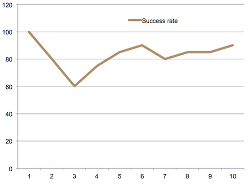
Success percentage trend chart: Not very helpful, right?
Automated tests are best at discovering regression. 50% failures mean nothing. 80% tests passed mean nothing. Your tests have either passed or failed. Ask yourselves, what a 50% failure means? Does it imply that 50% of your software works? Does it imply that half your features work? Or does it imply that your features work halfway? The figure is not indicative of anything. So using this metric to decide the health of your project leads to a very wrong picture.
Let us say however that you have a large suite of tests. This metric still fails. In fact, this is a dangerous trap to fall into. The first thing to say would be "oh, let us have someone analyze these tests and let us know what the failures mean". Very quickly this "someone" will turn into a team that will require a manager and time all of its own. Soon after that, your reports will not be enough. You will need trend charts. And statistical analysis thereafter. Before long somebody will suggest that you use data mining techniques to predict where your tests might fail.
Losing sight of the fact that automated tests are meant to test regression and little else is a dangerous thing to be trapped by. Learn to smell this foulness early.
"Trend" charts
Your tests are not like stocks. They are not twitter feeds. They certainly aren't an indicator of changing fashions. So, trends mean nothing. Again, ask yourselves. If you had 80% of your tests passing yesterday and 78% passing today, does that imply you've "slipped" by 2% and therefore its not a big deal? What if those 2% contained your most critical security test? What then? Based on your "trend chart" not much has happened, but perhaps you've just blown a big hole in your app and this "slippage" having warranted no investigation will go unnoticed.
Trend charts are useful for certain other reasons, but do not use them to look at trends of pass/fail percentages. Trends are particularly useful in weeding out tests that are flaky and don't perform consistently. Consider using a heatmap to visualize this information and you might quickly find tests that you need to get rid of.
Conclusion
It is most important for your reports to provide as much visibility into your tests as possible. The report itself should be published as raw data and separated from any specific presentation layer. The raw data format should be easily dealt with programmatically, for example, JSON/XML/yaml etc. Most importantly it is not helpful to look at your tests for any more information other than regression.
Disclaimer: The statements and opinions expressed in this article are those of the author(s) and do not necessarily reflect the positions of Thoughtworks.