


I’ve always been particular about the look of things. I’m a designer. So it’s both a blessing and a curse to be constantly tuned in to the lopsided accidental world around me. I’m always looking for evidence of design and underlying structure and marveling at the mastery and the chaos of the built world. My eyes are a high-bandwidth channel. I can’t help but notice everything.
Three years ago when I joined Thoughtworks, I was inspired by the opportunity to work for a company that was famous for agile, for reliable delivery and smart collaborative teamwork. However the lack of sophistication in the visual identity was apparent. The website had been designed by developers. It was not pretty, not responsive, hard to use. It was disorderly and full of words that I wasn’t encouraged to read. That was back then. A lot has changed now, and this is a small part of the journey we took to capture the essence of Thoughtworks in a visual and powerful brand identity.
Sowing the seeds
When I joined, Experience Design was a fledgling capability that Thoughtworks was nurturing. We had a small team of passionate, opinionated designers who cared about the same things as me. We ruminated on the parlous state of the website. Eventually, in a potentially mutinous act, we assembled examples of world-class digital brand experiences from the best in the business and presented them to our Chief Strategy Officer, Chris Murphy. Chris was an extremely supportive sponsor of the brand refresh, which contributed in great measure to its success.
Branding and marketing does tend to be viewed through a skeptical lens by highly technical and logical folks. I sensed among some of my colleagues, a suspicion of the artful manipulation of perceptions that marketing and design can achieve. So for all the left-brain people in the world, I’ve created this little formula to demystify things:
The Brand equation:
[visual identity + messaging] x [word of mouth + relationships] = reputation
For too long, Thoughtworks had relied on word of mouth and relationships to build our reputation. Our brand had not been something that we controlled - we let our external markets decide our brand. Worse than that, because our disparate efforts at marketing ourselves were done with no consistency across regions, it was actually damaging our brand, and making us invisible to those who we most wanted to reach.
By creating powerful messaging and a consistently strong visual identity, we knew we could maximise our impact and reputation in the market. We spent the better part of a year on defining and then testing and refining our messaging both internally and with our clients. The Ambitious Mission messaging was getting traction and we were iteratively improving our digital channels to amplify the message.
The Visual Identity - Cohesion in Diversity
We worked with both Thoughtworkers and external design agencies, to address the brief for our new visual identity. The key aspects of the brief that we considered important to achieve were:
- Giving a human and authentic face to Thoughtworks (our value is in our people).
- Projecting the diversity of our business and our people (not just an equal opportunity employer but actively engaging in the global south).
- Developing a flexible framework of visual design elements that could be adapted for different audiences and across different regions.
There was a lot of unbridled creative thinking - a bunch of work was presented and refined and presented again. After the initial enthusiasm had abated, all we had were a bunch of rejected concepts, some with tantalizing possibilities, others completely missing the mark. Following much soul-searching and U-turns, we realized that we had to knuckle down and make some hard decisions on the design approach.
So the core team of four designers decided to use an immersive guerilla-style approach. Laptops open, we worked in feverish time-boxed spurts of creativity, to finesse the key elements of our new visual identity. It felt like the mother of all design-jams.
At the end of the week, we had the following basics for the identity established and agreed:
#1 The Font: Open Sans
We loved it for so many reasons. It was a free, open source font that anyone could download. It came in many font-weights, which gave us a lot of freedom to provide emphasis and structure to our words.


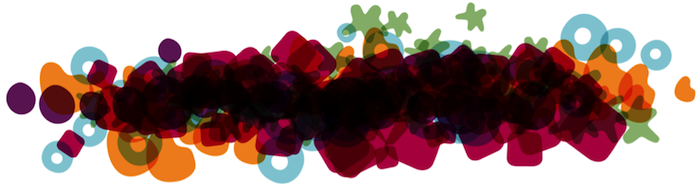
#2 The color palette
6 warm tones + 6 cool tones + 6 neutrals = 18 colors of diversity


The color palette is a broad one. Thoughtworks is not one color. We’ve even liberated our word-mark in the colors of our new palette. We particularly liked the disruptive element of the neutral flesh-tones, which bring a warm humanity to the otherwise bright assembly of hues.
#3 No. Stock. Photography.
We wanted to be honest in all our visual communications and present an accurate image of who we are and what we do. Our photography had to be authentic. It had to be our own.
In ruling out the convenient option of stock photography with all of its artificial studio lighting and perfectly focused imagery, we were left with a pretty tough constraint. We had thousands of photos taken by Thoughtworkers over the years but they were distributed across various Flickr accounts and none of them were in a central spot where photographers were happy to share them for general use. So we ran a photography competition to generate thousands more photos that our people were happy to share.
Many of the photos were shot on smart-phones and weren’t always shining examples of the art of photography. The solution was to develop a consistent color treatment for the lower quality images that were not of SLR standard. The color treatments allowed us to de-emphasize the quality of the image. We could still tell our stories in a visual way and the photos could provide an engaging backdrop for our words. We also had lots of really beautiful photos taken with DSLRs and these photos of our people and our work have been used extensively in our client stories, printed collateral and on our website.
#4 Surprise! The Story of 11 Glyphs


Whilst fonts, colors and photos formed the core of our visual identity, there was still something missing. Where was the quirky, unique and unpredictable element that characterizes Thoughtworks? That’s how the glyphs were conceived. They are asymmetrical, organic little characters that we use to express an emotion or illustrate an abstract concept. Chad hatched them out of nowhere; they were magically born during that feverish week of design. These little bundles of fun give voice to our ideas, and we like to sprinkle them liberally across our communications. When two of these little characters get together they can form new shapes, and endless possibilities.
Rollout
So that is the short version of how we created a new visual identity.
But it's not the end of the story. The hard bit came after - the rollout.
Testing the new identity with our various external audiences gave us the confidence that it would work. But our toughest audience is our own people. Almost three thousand Thoughtworkers around the world - how would we induct them into their new visual identity? This is still a work in progress, part change management and part evangelizing to win the hearts of naturally skeptical people.
Analytical thinkers often look for the rationale for change and for evidence that it is the right thing. Rather than thinking of brand as a dirty word, a game of deception, we are asking people to think of our new visual identity as an agency to amplify our message and underline the truth behind our ambitious mission in the world. It’s a long-term goal, and we’re learning and improving each step of the way.

Disclaimer: The statements and opinions expressed in this article are those of the author(s) and do not necessarily reflect the positions of Thoughtworks.