Enable javascript in your browser for better experience. Need to know to enable it? Go here.
Blogs Banner

Why do Chinese websites and apps look so busy?

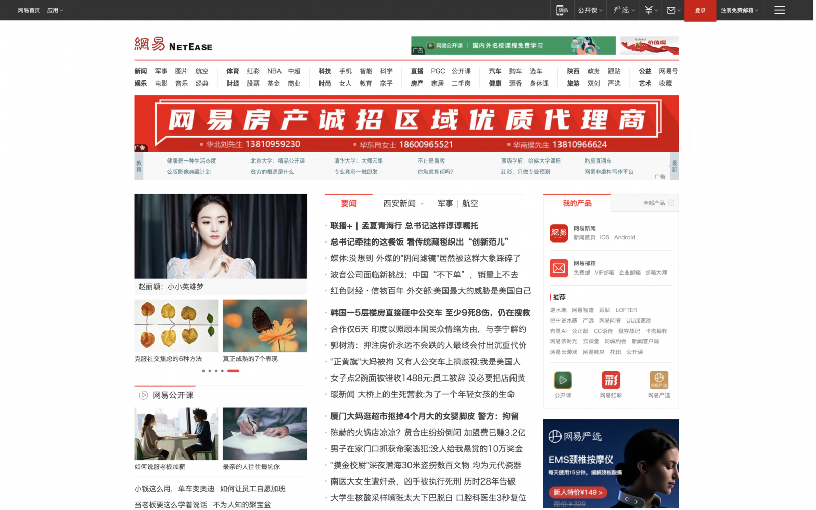
The aesthetics of modern Chinese digital products can look very different to primarily English-based apps and websites. If you explore some of China’s most popular websites and apps, such as 163.com (news), Jing Dong (e-commerce), Taobao (e-commerce) and Didi (ride-sharing), you will find that they have high information and feature density and highly saturated colors. 

Why is this? This article explores some possible hypotheses about why there is a perceived or actual difference in digital product design.


Internet speed limitations and subsequent rapid change

If you wanted to access the Internet in the early 2000s in China, you needed to install a wired telephone and a modem at home, and access the Internet via dial-up. Data usage was extremely expensive, browsing a few web pages could easily cost hundreds of yuan in telephone bills, which was considered an astronomical price at the time. Internet speeds were much slower than developed Western countries. 

The earliest layouts and designs of web pages had all the information displayed in one place, so that after loading the page once, users could quickly navigate to what they were looking for rather than clicking through to another page and waiting for it to load. It also helped to save telephone bills. 

As dial-up access was gradually replaced by broadband access, and broadband access evolved into wireless internet access with the introduction of smartphones, internet speeds became significantly faster from 14.4K dial-up to today's 5G network*.
 
Such rapid and dramatic changes can take a long time to digest and evolve unevenly across the country. It may be that many products did not catch up with the new minimalistic design trends, which explains why many traditional websites are still  very information heavy with lots of text over images and videos. It may also be because mobile phone penetration grew so quickly, with mobile users surpassing PC users in 2014. This meant that companies decided not to invest money in rebuilding websites and focussing instead on  building the mobile experience.

Language differences

Chinese characters, also called Hanzi, are a logographic-based language, which evolved from pictographs. Pictograms are highly simplified pictures of material objects. Therefore, Chinese characters can contain both images of represented objects and pronunciations. Examples of such include, 火 for "fire" and 木 for “tree” or ‘“wood”. Unlike phonetic-based languages such as English and French, Chinese language carries more information by nature, and therefore Chinese people who have long been nurtured by the complexity of Chinese characters, are also good  at processing dense and large amounts of information.

Secondly, Chinese characters are also known as square characters, and their square appearance makes them visually more dense and symmetrical, which is why many Chinese news websites look like a collection of small squares combined into one large square.

Designers who speak English often use italic and underline style fonts or CAPITAL LETTERS to emphasize certain information. However, Chinese fonts do not have similar expressions, so other methods such as images and colors need to be introduced to create a sense of contrast to emphasize the message.

Intense competition

Every industry is facing intense competition from traditional competitors and new entrants. The “build the right thing and they will come” mindset alone is not enough for a digital product to acquire and sustain users in China.

App owners try to create one-stop platforms that bundle all products and services in one place. First, it prevents users from needing to download separate apps and perhaps lose their engagement. Second, it increases the barriers to entry for competitors who cannot quickly provide the same products and services at once. Naturally, the growth in all the products and services available to the customer will mean more to show the customer on one page.

With so many apps vying for attention, apps also use as much space as possible to provide customers targeted offers, show their latest campaigns and more in a bid to grab their attention. 

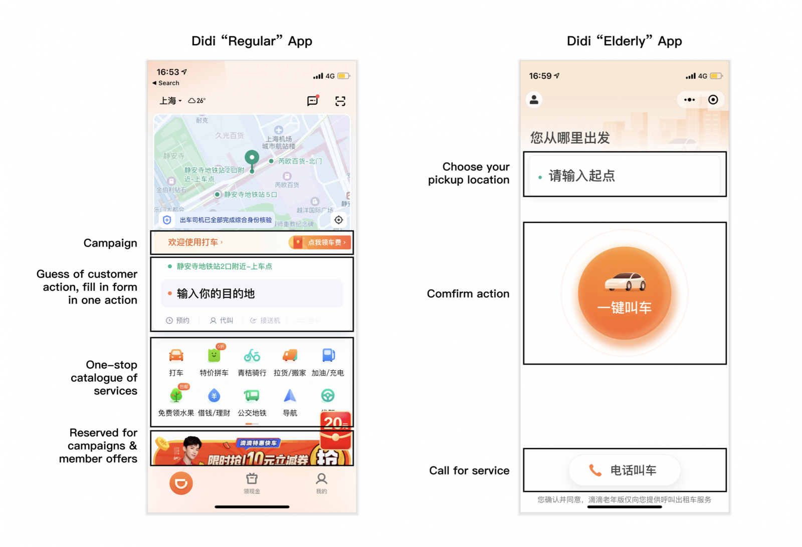
It’s not that they cannot design simple, minimalist interfaces, but rather than busy interfaces make more commercial sense. Compare Didi’s “regular” mode to their “simplified” mode targeted for the elderly, one is filled with information on services and offers while the other is much closer to the design aesthetics and interactions of Uber.
Source: Screenshots of Didi with author annotation

Summary

This article sets out my assumptions that have led to differences between the interface design of Chinese and English-based digital products, namely rapid change of internet speed, language differences and fierce competition in the market. There are still more discussions related to this topic, however, in an evolving digital landscape, new design trends emerge every year, all digital products are constantly changing with the goal of serving their users better, let's look forward to the future of digital products in China!

*"The Internet Timeline of China 1986~2003 - CNNIC." 28 Jun. 2013, https://www.cnnic.com.cn/IDR/hlwfzdsj/201306/t20130628_40563.htm. Accessed 9 Jun. 2021.
 *China Internet Network Information Center (CNNIC) data cited in https://thenextweb.com/news/in-china-more-people-now-access-the-internet-from-a-mobile-device-than-a-pc

Disclaimer: The statements and opinions expressed in this article are those of the author(s) and do not necessarily reflect the positions of Thoughtworks.

Keep up to date with our latest insights