


Setting the Scene
My team and I were excited by the prospect of adding fingerprint login to the iOS version of our banking App. It was something our users had been asking for. As a team, we wanted to try out the new technology and create a more user friendly and quick way for customers to login and access their bank information.
As a team (comprising of Developers, BAs, QAs and myself for XD), we’d considered different user scenarios and security issues for fingerprint login. We’d researched how other Apps had implemented this functionality; but the more we delved into how Apple required us to implement their API, the more I questioned the usability for the end user.
The functionality was fairly new in the marketplace. Although users were familiar with unlocking their phones using TouchID, I was skeptical if they would find the process of logging in to the banking App with their fingerprint (over a pin) intuitive.
Our App was receiving great reviews and had won awards for the user experience it provided. Although we had time constraints, I didn’t want a third party API to undo all the hard work that had gone into creating a great experience.
[When comparing Android and Apple, we had found that Android had solved the concerns we had with Apple, but the actual scanning mechanism on the button was better on Apple. Ideally, for the optimum experience you need to combine both solutions.]
Your Time Starts Now!
We release an updated version of the bank App every 6-8 weeks. With each release we not only add new features - fingerprint login or eStatements, for example; we also needed to ensure that it created the best experience for the user, met stakeholder requirements and was within the budget. Therefore, user testing couldn’t be a drawn out process which lasted several days. I had one day to user-test the fingerprint login.
Who to Test?
Although the main target audience of the App is the baby boomer generation, the app does have a lot of users in the lower age brackets.Taking this into consideration, we conducted our user testing across different age groups, some of whom were already TouchID users. Having a good mix allowed us to understand if problems were consistent across the board, which would, in turn, allow us to create a better experience for all users.
Morning session
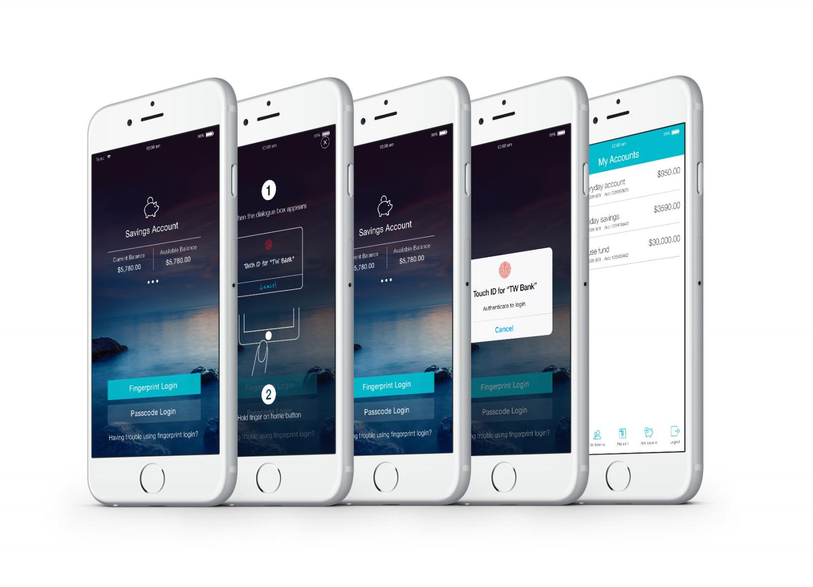
Luckily, for the user testing, we already had a production build of the App. This allowed the user to experience the entire process of registering and scanning a fingerprint. We started by asking them to register their fingerprint on the iPhone (the App would allow users to set-up a fingerprint login only if their fingerprint was already registered on the device). Taking them through this process allowed us to create an ‘as real to life’ experience as possible, under the conditions. They were then asked to login to the App and complete the flow to setup the fingerprint login for mobile banking. Users passed this process without any concerns.

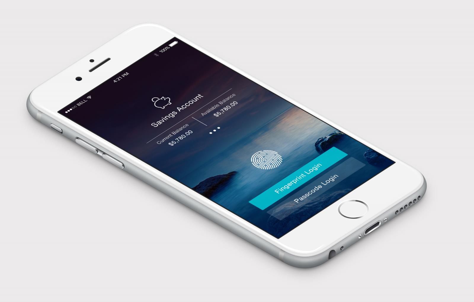
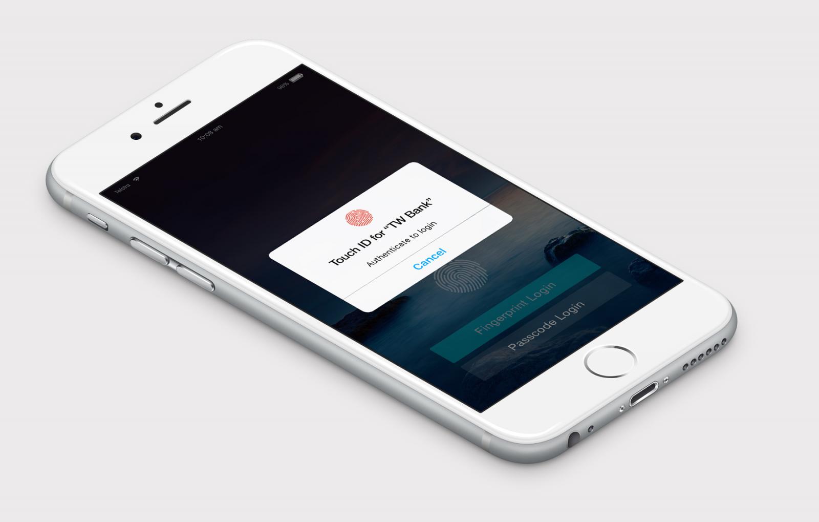
It was in the next process that we asked users to complete which validated our concerns. After registering their fingerprint on the device and completing the flow inside the App, they had to login with their fingerprint. We asked them to log out of the App and log back in using their fingerprint. Once they tapped the ‘login with fingerprint’ button, the standard Apple TouchID modal appeared. At this point, the user is meant to scan their fingerprint. Instead, we saw the user instantly getting confused and quickly frustrated as they tried various ways to get it to work.

What was so confusing?
I had concerns that the restrictions and style of the modal would confuse users. On observing users and chatting with them, these concerns were proven.
Once the modal was activated, people saw what they thought was an error message, even though they had been shown a similar modal when unlocking their phone. In this new context, they panicked and pressed ‘cancel’, which meant that they had to start the login process again.
From regular user testing that we do for every release of the mobile App, we’ve noticed that people, particularly a younger audience, simply don’t read lengthy text. They dismiss information in the screen or inside a modal, and simply click the ‘ok’ button during onboarding flows, rather than reading what they are doing. After several failed attempts of trying to login with their fingerprint, they finally read what little copy was available inside the modal, but this just confused them more. Most gave up and logged in with their pin.

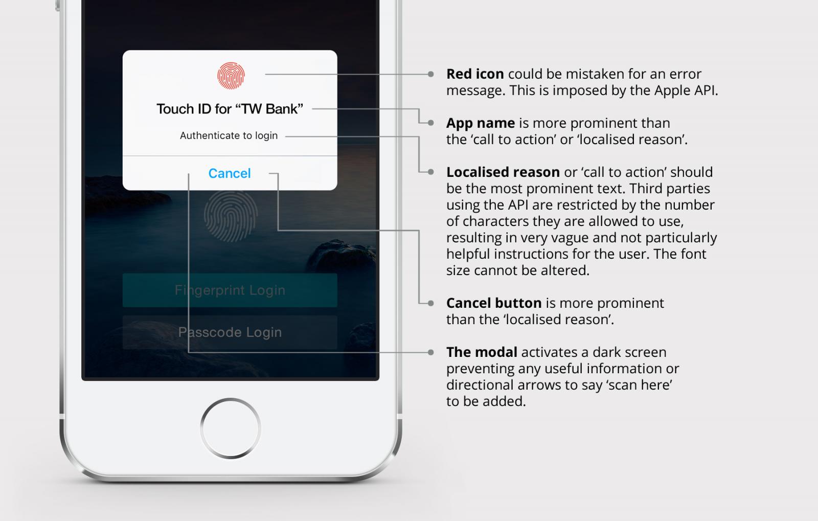
- Everything about the modal design looks like an error message
- The icon is red. Red represents danger or error in a majority of countries
- The hierarchy of the text is incorrect. The name of the App and the ‘cancel’ button are more prominent than the call to action or localised reason as Apple refers to it .
- Restrictions imposed by Apple:
- Apple only allows third parties to edit the localised reason, resulting in the App name being more prominent.
- The number of characters for the localised reason is also restricted, resulting in the instructions being very vague and unhelpful for the user.
- The modal activates a dark screen, which prevents us from adding any useful information or directional arrows that say ‘scan here’.
Throughout the testing process, only one user instantly understood what was required. On further questioning, she revealed that she had used the same functionality with another bank. She said that she was initially frustrated, but eventually understood how it worked.
Lunchtime:
After we’d finished the morning session of testing, we decided we had enough information to confirm our concerns, even though we’d only tested a small number of users. To fully maximise the time we had, we felt it was best to spend the testing session in the afternoon trying alternative solutions.
Adding a simple set of text instructions above the login button would be very quick to implement; however, we knew that our users seldom read text that was more than a few words long. This made it a less than ideal solution. Adding a simple arrow below the modal to say ‘scan your finger here’ would have been more intuitive, but this was prevented by the Apple API.
I sketched two paper prototypes to test:

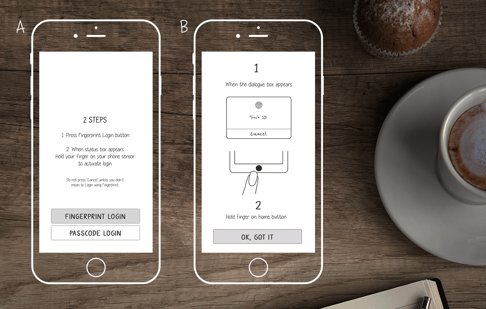
Prototype A: We gave the user a set of written instructions. This would be the quickest to build, but knowing our users, we weren’t convinced this was the best solution.
Prototype B: We used a visual graphic with very short text.
Afternoon Testing Session:
We went through the same process of registering the fingerprint and setting it up within the App on the device. We then moved to the paper prototype flow to test our new versions. We conducted these tests with a new set of users. We also managed to ask some of the users from the morning session which of the new prototypes they preferred.
The Results:
Very quickly, we realised that our users preferred the visual graphic approach. By visually showing them the action rather than explaining it, we made it far easier to understand.
Late in the Day and Running out of Time!
We had validated our concerns and tested two options. The more complex option was the preferred one, but did we have the time to implement it?
Although the team had been kept informed of our findings throughout the day, and the main stakeholder had been involved in the user testing, we still needed to decide as a team what we were going to do, given the time it would take to implement this on iPhones, iPads and then test it.
We gathered the entire team together to share what we had discovered and the two possible solutions. Although option A was far easier to implement we decided that option B would give the best experience.
We were up against the clock. I paired with our lead developer which meant he could start building the page, while I created the graphics. By the following morning, the new flow had been implemented across all iOS devices which had TouchID capabilities.

Final Solution
For any onboarding flows, we usually present the user with large ‘Ok’ or ‘Cancel’ buttons. However, for our new help screen, we wanted to change this usual behavior (of tapping a large ‘OK’ button to proceed), to ensure that they looked at the instructions. Replacing the large ‘Ok’ button with the familiar ‘close’ icon (X) in the top right, not only changed their usual behaviour by ensuring their eyes spent enough time looking at the graphical instructions before proceeding, but, also used an icon they were familiar with from using other applications.
Mission Accomplished!
Soon after launching the fingerprint login, the App reviews from customers started rolling in. And they were good!
What can we learn from this?
Why should we care about testing the user experience on a third party API?
Many Apps in the market use the ‘default’ from Apple and have just accepted what they’ve been given, rather than thinking about its usability and the frustration that it causes users. But, why? It’s the quicker option, but how does that help your brand give a better user experience? The user won’t know the constraints you’ve been given by Apple. They’re just tapping on your App icon, looking at your brand being displayed and not enjoying the experience. Ultimately, if they become frustrated, they will blame your brand.
We wanted our App to ensure a great user experience. Especially, when we could solve the problem.
What could Apple have done better?
When you’re dealing with third party APIs, there are inevitably constraints. It appears as though Apple’s focus was skewed more towards launching the new feature as quickly as possible, overshadowing the user’s experience. Whether or not they had the time or money, if they’d considered ‘real users’, they could have created something that was more intuitive. As Steve Jobs once said:
“You’ve got to start with the customer experience and work back towards the technology – not the other way round.”
Hopefully, the next release will be more intuitive and have some of the refinements that Steve Jobs might have demanded.
What can brands, developers and user experience designers learn from this?
Mobile phone developers need to understand that people are not just using their phones to access Apps developed by them. They’re downloading third party Apps. If you truly want your mobile device to provide a great experience, you need to allow third party Apps to integrate seamlessly with your software. Apple is known for restricting users from integrating with their software. In today’s world, this is not something you want to be known for.
When you’re developing a new product, don’t just look inwards. Look at the wider picture to stay ahead of the game.
If you’re building an App that uses an third party API (like many Apps need to), consider the restrictions imposed by the API. Sketch out the path that a user will take when performing a task and think about how you can make the process as easy as possible. Then, look at restrictions imposed by the API or even a third party library that you’re using, and consider what impact this has to your user flow. Follow this up with user testing to find an ideal solution which best fits with the user experience and the effort it requires.
Remember your user will judge your brand on the experience that you give them.
Disclaimer: The statements and opinions expressed in this article are those of the author(s) and do not necessarily reflect the positions of Thoughtworks.