


It can often be difficult to devise an appropriate strategy when it comes to testing on browsers and devices. Exhaustive testing of all browser/device combinations is an exercise in futility; we must consider a smarter and more realistic approach. Using user data to drive your strategy will help you to focus your efforts ‘where they are needed most’, while adopting a risk-based attitude to coverage and defects will help you prioritize ‘what really matters’. In this article we discuss how we used data from Google Analytics to devise our own strategy for the Thoughtworks website.
Everyone is always raving about the latest mobile device to hit the market. Faster. Better. More features. More RAM. More oomph. The excitement is often palpable, but to me, it just means one thing.
Headache.
Working out how to support your latest software project across different devices is a tricky business. Even with a product that is somewhat hardware agnostic - such as a website - all manner of factors come into play - such as operating system, real estate (screen size and resolution), compatible browser/OS combinations… the list can become as fractious as the device market itself.
Devices (and tablets) aside, even desktop browser testing can be an arduous task. Gone are the days of supporting only Internet Explorer, Firefox, Safari and Chrome; we must now contend with a number of concurrent browser versions, across different platforms, multiple permutations resulting from responsive design... not to mention the growing number of smaller, open source and fringe browsers appearing on the horizon. And, with the advance of web technologies, legacy browsers trail further behind in the compatibility stakes, making it very difficult to support higher-end functionality.
Faced with this near-overwhelming conundrum, businesses and development teams can often find it difficult to devise a suitable strategy for browser and device testing. Many, fearing they don’t have the knowledge or understanding of the customer demographic(s) required to make an informed decision, will opt for a blanket ‘works on all compatible browsers and devices’ approach.
Opting for a 'works on everything' strategy causes issues as it doesn't appropriately define the problem. What does 'works' mean for each respective browser/device? Are cosmetic issues acceptable? If 90% of browsers ‘work’ but 10% of low-traffic browsers don't, then does the feature fail as a whole? It also asserts that all browsers are on an 'equal footing' in terms of importance - so a bug in a low-traffic or relic browser has to be treated with the same importance as the number one browser (if we follow the 'works on all browsers' statement to the letter). These result in a nightmare for the teams who have to implement and test such a strategy, as it quickly becomes unmanageable and gargantuan in scope.
Conversely, choosing a very limited subset of browsers/devices, with no scientific approach, can lead to a strategy which may already be dead tomorrow once the latest ‘big thing’ hits the market.
In the thoughtworks.com website team, we faced this challenge ourselves. Our website is one of medium size, with approximately 200k monthly visits, and the technology underpinning it is designed to provide compatibility across the majority of browsers/devices, thanks to our responsive design. However, we still faced the same questions when it came to devising a browser strategy. We previously had a rough browser strategy, which was to support and test the latest versions of Chrome, Safari and Firefox, a legacy version of Internet Explorer (specifically IE8-IE9), a few iDevices and one Android device - but we knew this was based on hunches and gut feel rather than a scientific method.
In order to address these queries in a meaningful way, it made sense to tap into the most powerful asset at our fingertips: the user behavior data, as captured in Google Analytics. Google Analytics is a free web analytics service, offered by Google, which tracks and reports on your website’s traffic. We were already using this service to monitor campaigns and traffic, but this capitalized on only a fraction of its capability and potential. By harnessing the browser usage figures that are automatically collected by the service, we could drive and ground our decisions on facts, rather than conjecture.
It is worth noting that Google Analytics is just one of several analytics services in the market. Piwik is a great option for those seeking an open source alternative.
Obtaining and Analyzing Data from Google Analytics
Google Analytics uses a block of JavaScript tracking code in your pages to collect your website’s data for analysis. This code must be inserted in every page you wish to track, with a different set of methods being used to capture mobile app activities. A wealth of information can be captured, including customer journeys, traffic, and browser and systems information. These are captured via:
- the HTTP request of the user,
- the DOM of the browser, and
- first party cookies.
The processed data are accessed via the Analytics Reporting web interface.
On browsing the main report in Google Analytics, we were able to see some basic browser/device data:

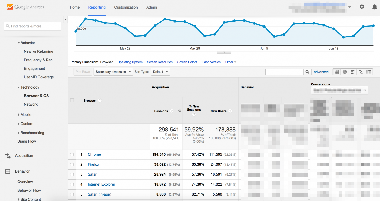
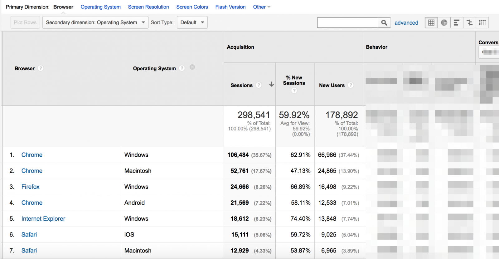
This is useful - however our aim was to drill down a little from the top-level browser and device information. This can be done by selecting a ‘secondary dimension’ for the data.

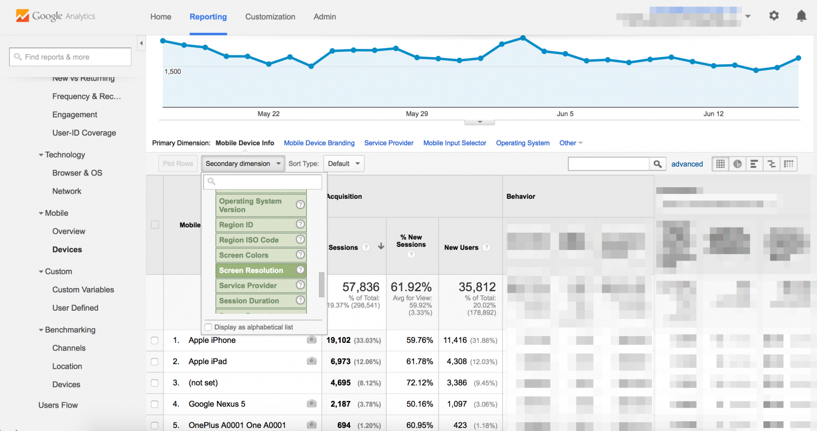
For mobile devices, this presented more of a challenge, as there isn’t a specific ‘device model’ option which distinguishes the models for Apple devices. Thus, we opted to specify a secondary dimension of screen resolution, and cross-referenced that with the corresponding devices to identify the phone models.

For both browser and mobile interactions, we wanted to rely on data taken over a few months to be able to model and predict trends. We used data going back as far as 13 months to see how our users were interacting with our site, and to compare this with our own assumptions that we had previously made.
Surprising Findings
On the whole, we found that our assumptions on browser/device usage were reasonably accurate - but there were a few notable exceptions. For example, although we were right in thinking that the most widely used desktop browsers were the latest versions of Chrome, Firefox, and Safari, there was also data that supported testing the previous browser version, as not all users upgrade or update their version at the same time. Our designing for/testing on Firefox was also flawed as we had largely concentrated on the Mac version, whereas the data provided overwhelming evidence that we should focus on the PC version.
When it came to legacy browsers, the data reassuringly pointed to a trend of being able to retire support for some older browsers (IE8/IE9 in particular). This allowed us to consider more carefully the time we invest in maintaining/fixing browser issues for these versions, as the value in it was not high enough to justify the effort required to achieve it.
On the device front, we saw a predictable trend of people using the latest iDevice, but that there was also quite a high retention for some of the older models. This meant we needed to re-evaluate our approach to design for and test on a wider range of devices. Regarding Android, we learned that our focus should have been on different device models altogether, and that Android models occupied only a fraction of our user base. These findings were quite an eye-opener. Also, as we had data that spanned 13 months, we could see the spike in usage of new devices, and how soon they appeared in relation to the release of those new models.
A Strategy That Works
Thanks to the data we had obtained and analyzed, we were able to devise a browser/device strategy. That meant we could start to:
- predict when to retire older browsers, and
- predict when to introduce new devices to the mix
This helped us develop a browser strategy that was representative of our user base, whilst also allowing for scale and change in their behavior.
In addition, we could now tailor our strategy to be pragmatic and reflective of the changes we intended to introduce to our site. Major new functionalities with many UI components would equate to a full sweep of all browsers and devices on our list (with the possible addition of extra, legacy browsers), whereas a small tweak to an existing piece of functionality would only warrant a sanity check on a couple of main browsers and devices. We could also use our knowledge of browser and device similarities to further cut down on some testing. For example, Chrome and Safari run on the same engine; so if our change is fine on Chrome, we can be reasonably confident that it will also work on Safari. Similarly, if something worked fine on IE9, it probably would also be okay in the latest IE version.
Of course, this didn’t give us license to invest in the purchase of several additional devices; so in addition to the considered purchase of a couple of devices, we chose to supplement real device testing with testing on a browser/device emulator (we opted for BrowserStack). In the ideal world, we would love to have a device lab, with bench after bench of devices to test against - but we still have to be pragmatic and think in the present, whilst casting an eye on tomorrow.
Our new, pragmatic strategy has meant that we can appropriately focus our energies where it will bring the greatest reward, and thus far it has given us payback in the shape of reduced support/testing effort, with negligible difference in reported issues.
Not a Perfect Answer
Of course, there are some obvious flaws and risks to be considered when taking such an approach to a browser and device strategy.
The most notable is that with a typical ‘80:20’ approach, there is the inherent risk that you can miss some peripheral requirements or issues that occur in other browsers/devices. Harking back to our earlier preamble, we know that we cannot realistically test or support everything and that we have to pick our battles. We must weigh the risk vs. the benefit in relation to each code change we’re introducing, and alter our strategy accordingly.
Additionally, the data from Google Analytics, whilst powerful, doesn’t take into account other matters such as accessibility, user location (whether local, national, or global has a direct impact on what browsers and devices we would expect to see in use), time of day (accessing a site during office hours is more likely to take place on a desktop than a mobile device), and so on. These are all valid and worthwhile considerations, so you should find other methods to subsume them into a wider strategy (more on these to follow in a future article).
Of course, you could be in a situation where you have no historical/current data - for example, when you are part of a new company and/or introducing a brand new concept to the world. In cases such as these, looking to model your strategy on that of your closest contemporaries can help. I would also advocate the use of focus/user groups of your target demographics, to obtain some real data.
Taking all of these points into account, by taking the fundamental first steps to identify your users, and making use of any data available, you’re certain to develop a strategy that works far better than supporting ‘everything’, and prevents you from taking a wild stab in the dark that may come back to bite you in the (not-so-distant) future.
Disclaimer: The statements and opinions expressed in this article are those of the author(s) and do not necessarily reflect the positions of Thoughtworks.