


Earlier this year Thoughtworks launched an internal contest offering a prize for the best data-related project created in 30 days. There was no restriction on exactly what could be produced, but the winning entry needed to be impactful, technically interesting, and useful. The best entries combined analytics, data mining and visualization and not only showed something cool, but made you think "aha" too.
Organizers of the competition had to choose from nearly two dozen entries from Thoughtworks teams and individuals. The winning entry, Visualizing Thoughtworks’ Travel, by Senior Consultant Sandeep Aggarwal impressed the judges with its impactful visualization of Thoughtworker travel patterns and for providing a compelling means of evaluating how travel impacts Thoughtworks’ consulting business.

Data visualization on many entries was very advanced. However, Sandeep’s effective use of the d3.js graphics library and his impactful visual design, were the main contributors to his entry being selected as the winner. With his entry, Sandeep demonstrated that effective analytics doesn’t necessarily require deep data science.
Sandeep’s technical approach was another key reason for his entry being selected. He recognized that the nature of the data lent itself well to a graph database technology like Neo4J. He also recognized that a functional programming paradigm was an effective way to interact with the graph database. Sandeep quickly learned these and other new technologies in order to create a very elegant solution on a problem that would have been much less elegant using a relational database and an imperative language like Java. As indicated in NoSQL Distilled, a book by Thoughtworkers Martin Fowler and Pramod Sadalage, Thoughtworks advocates polyglot persistence as well as polyglot programming. Sandeep demonstrates both of these principles.
As a global consultancy, heavy travel is an inherent part of Thoughtworks business. This is further compounded by the importance of face-to-face communication. As a result of Sandeep’s work, Thoughtworks' leadership now has the ability to examine travel patterns and can begin to explore ways to make this travel more sustainable and less impactful and costly. As a result of the 100 Days of Data contest, analytics has become a prominent aspect of Thoughtworks capabilities. Many Thoughtworkers have continued to deepen skills in data manipulation, data persistence, data science, and data engineering using both SQL and NoSQL technologies. Thoughtworkers recognize that data is at the center of nearly every application we build and every client we serve.
Read our Q&A with Sandeep to learn more about his approach and application.
Q: Why Thoughtworks travel? And what was the first thing you did?
A: One of the datasets that was available as part of this contest was the data of all employees since the start of the company. That is more than 20 years of data, containing information about skill sets, travel information, office information and in several formats. Of course, you could pick any data set that you want. I decided to tackle it. First I asked myself...what is going on in this data?
Q: What was your biggest challenge?
A: The biggest challenge with was the data itself. Information like “I know java (somewhat)”, “C++ beginner” or “I want to do Clojure” are a few examples. Since everyone had the freedom to enter their information in simple text format over the years, the biggest challenge was to actually get valuable data out. Bits and pieces of information spread out across multiple data dumps was a big problem. Linking together was yet another problem.

So, I knew I didn’t have enough time to go through the entire data set, but needed to focus on the data that I intended to build my application with. My main aim was to find travel information and if time was available then skill sets based on regions.
Q: How did you set out to analyze the data?
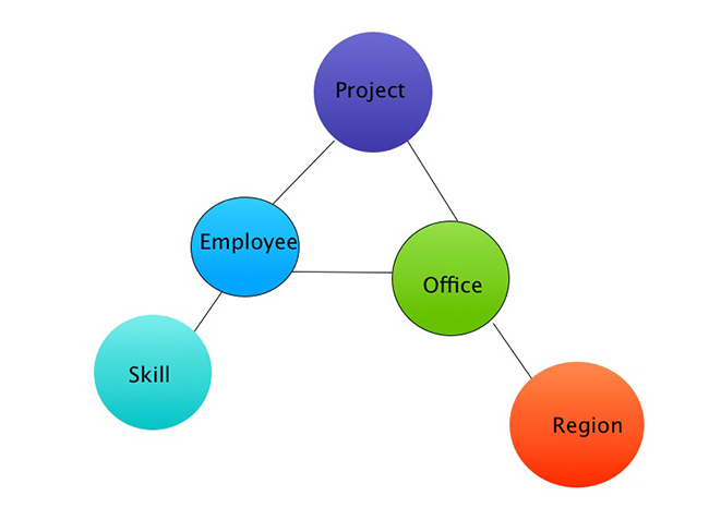
A: This was a perfect opportunity to use graph databases. Neo4j was a good fit for this problem. Analyzing region, offices, employee, skills and travel information and projects relationship was such fun and geeky work. Here is simple query that gives me all the skills based of a region.
“START r=node(0)
MATCH r-[:employee]->e-[:has_skill]->s,
e-[:home_office]->ho<-[:has_office]-re
RETURN re.region as region, s.skill as skil”
It was still a lot of information and to further make use of it, Clojure really made it easy. Using the data from above query, you can simple group them by region with:
(group-by :region data)
In another example, if I wanted to group everyone based on their home/past office:
(group-by (juxt :home_office :past_office) data)
And done. Clojure really helped me write less, but clear and expressive code. There are a lot of reasons why I picked Clojure. One is that if I could I would use it in every task. Second, it works so well with this challenge, especially when you are trying to structure your data. Its powerful features like macros and in built functions lets you do that with ease.
Here’s a more detailed description of the app I built.
Description: There are two features: Travel and Skill information.
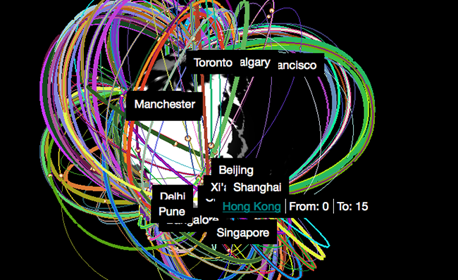
Travel: This visualization displays the entire history of TW travel based on past offices.
- Search for any office or employee, default view is All TW History
- Timeline - This gives the option to view the travel information by month/date.
- Info - View the number of people travelling between offices and dates for any employee
- Demo - Auto rendering and display of information for the current selection (All TW, office, employee)
- Visualization: Particle travel direction dictates the direction in which people have been travelling - Eg. From Chicago to Xi'an. The route thickness is dictated by the number of people travelling on a route. In office view, the 2 different colors differentiates people travelling from/to that office.
Skills: The aim was to analyze the skill set that Thoughtworkers have by region.
- Displays bars on globe for all the skills and total people listed a particular skill in a given region
- Skills are color coded across regions
- Hover over them to view the number of people with that skill
Visualization: The bar height is dictated by the number of people listed a given skill.
Challenges:
- Three.js document is lacking. The best way is to go through the examples.
- Webgl is cool, but have to be careful on how much you want to render and how you are rendering. Too much and performance can take a serious hit.
- Animation is a pain, and have to control them. Tween.js works well for this, but sometimes messes up the mouse controls if let loose.
- XYZ position calculation is tricky and have to go through a lot of examples and forums to see how people have solved an issue.
Learn more about our Agile Analytics practice.
Disclaimer: The statements and opinions expressed in this article are those of the author(s) and do not necessarily reflect the positions of Thoughtworks.