


On the Mingle team, we’re constantly thinking about how to advance our thinking on software delivery. That’s one of the reasons why we’re excited about aligning ourselves more closely with Thoughtworks’ views on software excellence.
Part of this process involves thinking about how our products reflect our values. We value, among other things, collaboration and transparency, so we try to build products that promote conversations and improve visibility.
Two of the more common conversations we hear practitioners having center around the questions:
- When will we be done?
- What can we get done by date x?
Mingle Plus includes the recently developed forecasting and fixed-date charts to help foster productive discussions around answering these questions. We’d like to share some insight into their development below
The Forecasting Chart: When will we be done?
To help answer questions related to forecasting, we took some cues from the work of James Shore and others onschedule projections. Mingle’s new forecast chart addresses how delivery dates may be affected by one of the more common forms of schedule risk: increases in remaining scope. “How?” you ask. Well, here you go:

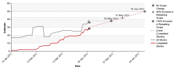
The forecast chart shows when your team may deliver--based on your definition of “done”--in relation to changes (0%, 50% or 150%) in remaining scope. In developing this macro, we made some simplifying assumptions, especially concerning velocity. We do not consider variability in velocity and sources of that variability (e.g. technical debt, customer availability, sick days). Instead, we use a constant average actual velocity to date.
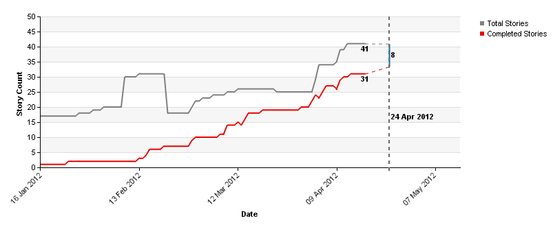
The Fixed Date Chart: What can we get done by date x?
So far, we’ve looked at how changes in remaining work impact our schedule. But what about when our delivery date is fixed and we have to communicate that some features won’t make the cut?
The Fixed Date Chart is intended to signal when we may not deliver everything we planned by a given date. When the actual velocity (again, average velocity to date) is estimated to create a burn-up that falls short of total scope, team members can have a conversation about which features are ready to be delivered and which may have to be left undelivered.

The resultant chart is intended to prompt conversations while negotiating scope between project teams. We have retained the flexibility of the chart so decisions around how much we think scope will increase, and therefore projections about when we may be done, are still left up to the those best equipped to make them: the delivery team. With the forecasting chart, Mingle Plus seeks to provide visibility of the interplay of project schedules to better monitor your program. Thus facilitating informed and timely discussions between various project teams.
Mingle Plus also includes other tools to enable you to flexibly manage your programs such as alerts, timeline charts and progress bars.
Know more about Mingle Plus features and how you can try it out.
Disclaimer: The statements and opinions expressed in this article are those of the author(s) and do not necessarily reflect the positions of Thoughtworks.