


I hear the following phrase once a month, sometimes more frequently: "I couldn't do what you do." This is a nice thing to hear from colleagues and clients, but it is also nonsense. Not only is visual design a skill set that anyone with the inclination can learn, it's something that everyone on a digital product team already does.
That's right: you are already a visual designer. Visual design exists in every discipline, and you are making visual design choices in the work you do, whether you realize it or not. No matter if you're a code-writer, manager, analyst, executive, or something else entirely, visual communication is part of your job because vision is one of the primary ways people communicate. Identifying and making these choices more intentionally is an easy way to improve communication and understanding within your team.

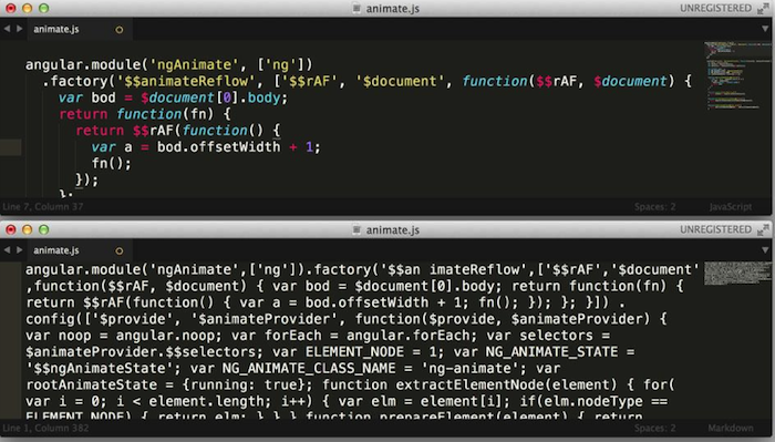
Consider the code snippet above. The code on the top does the exact same thing as the code on the bottom. With the exception of replacing carriage returns with spaces, it’s line-for-line the same code. And yet, I’ve never met anyone who writes minified JavaScript. Why?
Because: as every Thoughtworks developer I’ve ever worked with tells me, ‘Good Code’ has almost nothing to do with the fact that it works. It has a lot to do with (amongst other things) its readability, understandability and by extension, maintainability.
Many of the things we do as code writers to improve readability and understandability are (gasp!) visual design choices. TheDecisionToCamelCase versus the_decision_to_snake_case or even to snake-case-with-dashes is a visual design choice. Syntax highlighting, indentation, even line breaks in some programming languages, are all visual design choices.
These are visual design choices because they do not change the semantic meaning of the name you’ve given something (indeed, many programming languages are case-insensitive). Rather, these choices make this given name clearer by using capital letters or underscores to put visual breaks in the phrase — something we normally do with spaces and punctuation — so we can more easily recognize its constituent words.
Why do we consistently use camel case or snake case within applications and even programming languages? To get a consistent visual pattern for object names. This isn’t just consistency for consistency’s sake, it’s consistency for the goal of creating faster understanding. It allows us to more easily and quickly read these names, because we only need to expect (and therefore consider) one version of this visual pattern for separating words.
Let’s look at syntax highlighting. The goal in color-coding different pieces of code based on type, purpose, etc. is not just to make it a little less monotonous to look at (although it’s certainly a bonus). Syntax highlighting allows us to replace recall with recognition as we work.
Recall is, “Oh! I just saw a single quote. If there’s another one, I know i’m dealing with a string. Where does this string end again? Better scan the code to find the very next single quote and not get them mixed up.”
Recognition is, “That’s a string because strings are yellow.”
Recognition allows for faster and easier understanding of the individual pieces of the code, specifically their types and purposes, which means you can spend more time writing new or better code, rather than parsing existing code.
There are a good number of these examples in code; indentation is another great one — it reflects the nested structure of the code without changing it, reducing the burden of understanding from, ‘How many close brackets have I seen?’ to “That’s one level deeper because it’s farther over”.
Remember, visual design is communicating ideas — any idea, from from brand character to complex technical concepts. Stopping at “this is aesthetically pleasing” is leaving out dozens of other ideas that are being communicated whenever we look at anything. The choices you make communicate specific ideas, and if you’re not making those choices with intention, It’s very easy to communicate the wrong ones.

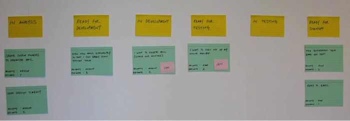
If you’re on a software development team and you’re not writing code, I guarantee that you’re still making visual design choices in your daily job - especially when you interact with a story wall. Whatever flavor of agile you use, you almost surely track work with a wall of cards, whether digital or physical.
The wall above uses a few different visual design methods to make itself more understandable — it places the swimlane titles at the top, writes them in a larger font, and uses differently colored cards. These three things create a visual hierarchy and pattern language that allow us to identify them as the most important card in the list, the category header.
Imagine if the titles didn’t have any of these things: also green, mixed into the order, same tiny writing. There would be no way to identify them as special without reading the entire wall first.
Again, these choices aren’t creating meaning within this world; they’re reinforcing existing meaning.
This wall is also communicating visually by putting the same type of information (eg: estimate) in the same place on every card (bottom left). By employing a visual pattern, I can now skim each card for its estimated points rather than having to read each card top-to-bottom to find out each one individually.
Other examples of visual design used often in story walls (but not in this picture) include: color coding stories vs. tech tasks vs. defects, visual grouping of different ‘swimlanes.’ Even the use of avatars rather than names to assign work creates faster (non-reading) recognition of who is doing what.
My point in all this is that design is not a role--it’s a combination of understanding, a few teachable skills and a lot of empathy. A good company needs to include design skills everywhere, in everyone.
Visual communication is not 'make it pretty juice,' and it’s not a process reserved for a special few. It's a set of tools that anyone with sight can (and does) use to create and reinforce meaning and understanding in our world. It’s something we all do every day in the course of our jobs.
The same ideas that govern an understandable card wall can be used to communicate complex information in a way that is easy for a user or a client or teammate to understand, to prove to them that we understand their problem without just saying so. It’s as simple as identifying these communication opportunities in your daily life and beginning to make them with intention.
You are already a visual designer. Start acting like one.
Disclaimer: The statements and opinions expressed in this article are those of the author(s) and do not necessarily reflect the positions of Thoughtworks.