


You know the feeling: stories seem to be taking just too long to be completed, velocity seems to be always just below what you expected, and you're not sure what to do about it. Pressure starts to build up, and the team starts to get uncomfortable with all the questions you keep asking about when they expect to deliver their tasks. What is actually wrong? Do you have problems in your process? Are people taking too long to develop code and test it? Or maybe the bottleneck is analysis? Are your stories too big, or too small, or just underestimated?
Wish you had answers to these questions? Well, we can't promise that. But, just like in science, we're confident that by gathering some meaningful data and looking at it with analytical eyes you can get some insight into what may be causing your issues. And we're not talking only about bread-and-butter, velocity, and scope. We need to go deeper!
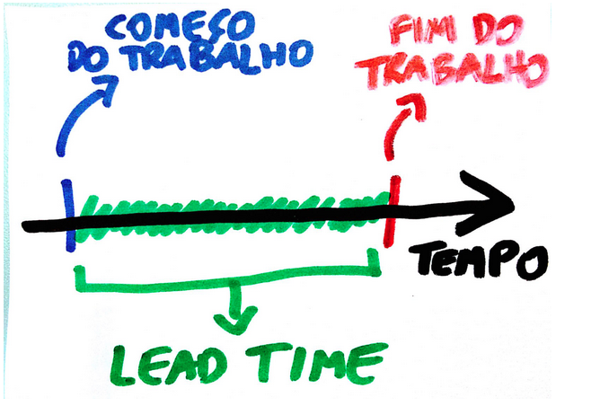
Tracking Lead Time
Every business process, including a software project, benefits from predictability, but there's a caveat: assumptions used to forecast things should not rule out change. While adopting low-level work deadlines and using them to forecast budget and delivery milestones may be a controversial practice, experience shows that there are some ways in which tracking time taken to finish stories and giving visibility to the team about it can help delivery run smoother.
In Agile/Lean/Kanban literature we can find several different ideas and names for metrics that track time work takes to be completed. There's also a long-standing debate on terminology inherited from different backgrounds (think Lead Time vs. Cycle Time). These are all important, but for simplicity let's assume a more plain approach: suppose we're able to track in a stable system how much time a story takes from the point when work starts to when it ends. Let's also assume the story play workflow follows a classic four-stage model like this:

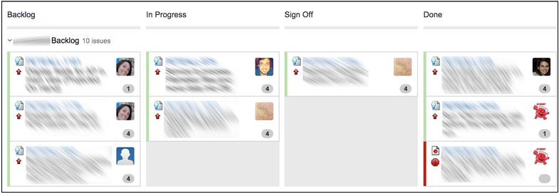
Stories sit in the Backlog section until a pair is freed up; after some conversations the pair starts the work by moving the story from Backlog to In Progress. At this moment the clock starts ticking. When development is completed the item is moved to the Sign Off phase, in which the story owner will take a final look. When it's all said and done the item is moved from Sign Off to Done. This is when the clock stops. The measure of the clock, in the context of the stable system of stories and transitions, is what we're interested in at this time. Out of the several possible names ("flow time", "latency", "development lead time", etc.) for this metric we'll pick, for simplicity, the one favored in the Lean manufacturing background: Lead Time.1

Now, this is just one of several possible configurations. You may have a totally different idea of a story workflow in mind, but hopefully this illustration still serves the purpose of defining what we're trying to track. In essence, more complex stories are expected to produce a longer lead time figure, and stories that are similar in complexity are likely to result in lead time measures that are also similar. Factoring in a little legroom, if we craft our stories properly these rules should hold, and as more stories are started and finished average numbers extracted from a larger amount of observations should converge towards a weak correlation between story size and lead time measure.
Make it visible!
So, in case all of the above makes some sense, what can actually be done with the outcomes of this observation and what are the potential benefits to the team? Let's see:

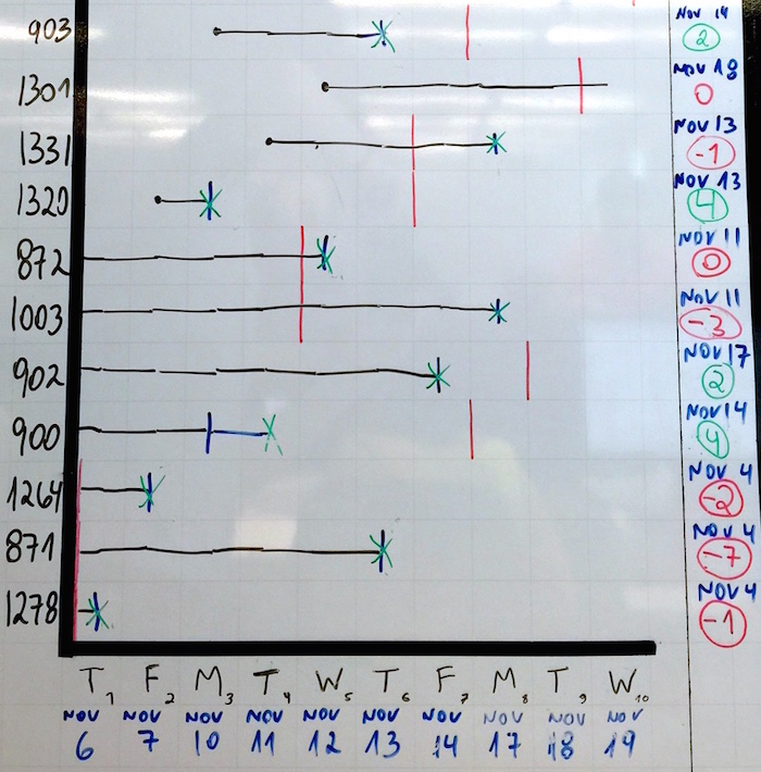
The graph above is an idea on how to give visibility to lead time. On the vertical axis, the numbers represent the work items (stories, etc.) that belong in the current sprint. The horizontal axis represents time, here depicted as each of the individual weekdays of a two-week iteration. Using a color code to identify the status for each item, here's how the team updates this board daily during stand-up:
- If a new item is started (i.e., moves from Backlog to In Progress), a black dot is added on the intersection between the item's line and today's column;
- For the items currently in progress a black line is extended to today's column;
- If an item has moved to Sign Off since last stand-up, we change the item's line color to blue;
- If an item is completed (i.e., moves from Sign Off to Done), a green "X" is added.
Did you get the idea? Since this board is visible to the entire team at all times and since the team itself (not necessarily the PM) updates the graph every day by adding and extending lines, the team has access to each story's current lead time measure at a glance. But wait, there's more!
- See the blue dates to the right of the chart? When an item is started the team takes a look at the story points; if a medium story should take roughly one week (five working days) to complete, this means that if we start "903" (a medium story) on Monday, November 10th, we should be done with it by Friday, November 14th. The number in green/red below the dates is the amount of working days left until the date arrives (if a story is "late", the number is negative);
- Finally, the vertical red lines: given story "903" is due November 14th, a red mark is added to the line on the column corresponding to that date. As we keep extending the story line every day during stand-up, we can visually assess how close we're getting to the deadline.
So, you might ask: what happens when an item can't be finished before it crosses the red line? There's chaos from the sky and everyone's fired, right? Of course not. Transparency is generally more powerful than pressure, and that's the key to all of this.
A valuable team tool
We all know that estimates are not much more than informed guesses, and we should expect them to often be different from reality. However, if done the right way, after a while the fluctuations should even each other out. When a team gets visibility into its own Lead Time data the people in it are empowered to identify what may be causing stories to exceed projections, and decide what to do about it. Sometimes a story needs to be split into smaller ones that more people can play in parallel; sometimes there's bad code design somewhere causing people to waste time with workarounds and the team decides to invest some time in refactoring it. In other occasions it's the scope itself that's not very clear, and more conversations with the stakeholders are necessary to clarify it. At the end of the day, it's up to the team to decide what can be done to achieve the time goals without sacrificing quality or any of the other principles that guide their work.
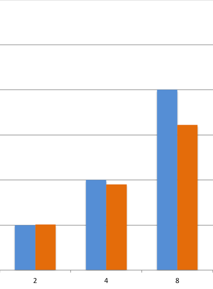
Here's an example: in one of our current teams, a few months ago, we started to feel like we were "slowing down". We had some stories dragging a little bit, but nobody knew exactly how much. After running a lead time analysis on the stories we had delivered so far, separating them into buckets by story size (2, 4 or 8 points), here's what we discovered:

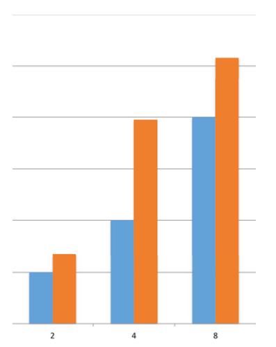
Blue bars: how long we expected the stories to take, on average
Orange bars: how long they were actually taking, on average
Small (2pt) and Large (8pt) stories were OK; they took slightly longer than the estimates projected, but these fluctuations are normal and our project planning had room for them. The Medium (4pt) stories, though, had a problem: they were taking, on average, twice the time we projected. We wanted to know why, so we ran a few exercises to get the team together and talk about this. We identified a few pain points: a lot of time was spent gathering additional details on stories after we started them; as a distributed team, remote communication was difficult at times; team was too big and it was hard to keep in the loop of all the different features being developed in parallel, just to name a few.
Having the numbers before our eyes helped us match our feelings of being "slow" with the actual data that confirmed and quantified this. Additionally, it helped us come up with action items to tackle the problems we've discussed in a targeted way. We've put together a plan for a team-wide reorganization, removing roadblocks and enabling closer communication. We felt really happy about the results, and it was great to see the evolution reflected in our metrics, which got better week after week. After a while, here's how our average lead time is looking like:

Give it a try!
When the team is surrounded by a healthy work environment where people trust and depend on each other, and when delivery leaders maintain a no-nonsense mindset that understands and embraces change, tracking lead time as a Key Performance Indicator is a powerful technique. It enables the team to reflect on its own results, relying on visibility rather than external pressures, and identify bottlenecks and pain points that need to be addressed. By measuring lead time, you can shift from feeling slow to knowing where your slowness is, which gives you a better chance to improve by making specific, directed moves. This has been a game changer for our team. Why don't you give it a try?
1 If you've read any of Paulo Caroli's pieces on lean and lead time you might ask yourself why isn't the time spent in the Backlog phase (or wait time) included in the calculation. That's a great question. In this case, an example captured from a real team, the idea of a sprint commitment is applied instead of a more dynamic "pull system", which causes items to spend some time in backlog without being touched by anyone, just because they're assigned to a given sprint. Thus, it made more sense to leave that idle time out of the calculation, and think of the "initiation" trigger as the transition to In Progress.
Disclaimer: The statements and opinions expressed in this article are those of the author(s) and do not necessarily reflect the positions of Thoughtworks.